


Choose Category → Select Columns → Pick a Gorgeous Style & You're Done!
The easiest way to arrange your articles in a clean, horizontal row. Comes with 3 pre-designed layout styles and automatic mobile responsiveness. No coding required.
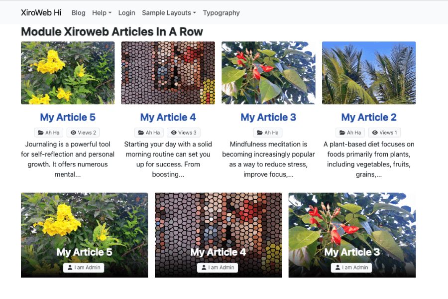
Are you a Joomla beginner looking for an easy, lightweight way to display your articles? If you need to arrange your posts in a clean horizontal layout without touching complex code, this module is built just for you.
Meet Article Row - Xiroweb; the simplest way to display 2, 3, or 4 articles in a single row with zero hassle.
Setup your beautiful article row in 3 easy steps
Choose the category of Joomla articles you want to display on your page.
Decide how many columns you want to split your row into (2, 3, or 4 articles in 1 single row).
Pick one of our 3 pre-designed layout styles. No coding, no HTML, no CSS styling required!
Designed strictly for simplicity, this module arranges your content perfectly into a single line. It automatically ensures all articles are responsive, looking fantastic on mobile, tablet, and desktop screens alike.
You don't need to be a designer or a developer to build clean article rows. Article Row - Xiroweb comes with three beautiful ready-to-use styles:
Because this module is highly optimized and lightweight, it runs flawlessly when meeting these simple setups:
For the best grid layout, make sure your Joomla template is built on Bootstrap 5 (the most common modern web standard).
Prepare your Joomla articles with Intro Images. This is especially important if you plan on using the gorgeous Style 02 (Overlay).
If you need to get your website up and running in minutes, simply choose Style 01. It requires almost zero setup and instantly fits any template style out of the box!
Managing grids on mobile view can be tough for beginners. A 4-column desktop layout will look too squished on a phone screen. Article Row - Xiroweb takes care of this automatically.
The module leverages Bootstrap 5's mobile-first breakpoints. Your 2, 3, or 4-column desktop horizontal layout will smoothly stack into a readable vertical layout on small mobile screens.
No configuration needed: The responsive grid system is fully automated. Simply select your column count for desktop, and the module handles the mobile views with zero extra effort on your end!
Enjoy a super easy, fast, and gorgeous horizontal layout with Article Row - Xiroweb.