


Customize Layout → Tweak Colors & Options → Watch It Update Instantly!
Create a fully responsive Bootstrap 5 navigation menu for your website in seconds. Packed with customization options and a real-time visual preview. No coding required!
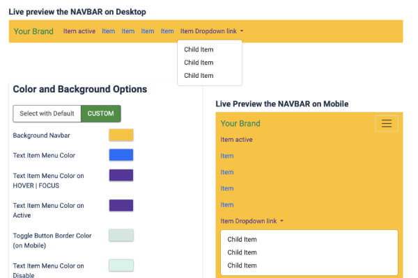
Struggling to make your website's navigation bar look professional and responsive? If you want a modern Bootstrap 5 navbar that you can customize visually without touching complex HTML or CSS, this module is built just for you.
Meet Bootstrap Menu - Xiroweb; the easiest way to create, style, and preview your Joomla navigation in real time.
Set up your modern website navbar in 3 quick steps
Choose any existing Joomla menu to automatically fetch your navigation links.
Easily change colors, alignment, dropdown layouts, and add your logo with simple toggles.
Watch your menu adapt in the Live Preview as you edit, then publish with complete confidence!
Designed strictly for simplicity, this module automatically handles all Bootstrap 5 classes behind the scenes. Your navbar will look stunning and work flawlessly on every screen size without manual coding.
No more guessing how your changes will look on your website. Bootstrap Menu - Xiroweb features an intuitive styling panel:
This module is highly optimized and lightweight, ensuring a super smooth setup when meeting these basic requirements:
Ensure your Joomla template is built on Bootstrap 5, which provides the modern styles needed for the navbar to load and collapse correctly.
Create your menu items in the standard Joomla Menu Manager. This module will automatically pull and display those links beautifully.
Want a premium look? Enable the "Sticky Navigation" option in the module settings to keep your menu conveniently locked at the top of the page when visitors scroll down!
Ensuring dropdown menus and mobile toggles work seamlessly across all devices can be incredibly tough. Bootstrap Menu - Xiroweb makes this completely automatic.
The navbar leverages Bootstrap 5's responsive grid system. On desktops, it presents a spacious horizontal menu; on mobile phones and tablets, it smoothly collapses into a clean, easy-to-tap hamburger toggle.
Zero setup required: The mobile responsive collapse triggers automatically based on standard screen sizes. No CSS media queries or coding needed from you!
Enjoy an incredibly easy, fast, and gorgeous navigation bar with Bootstrap Menu - Xiroweb.